Online surveys aims to follow the principles of the W3C Web Content Accessibility Guidelines. However, accessibility is not just a technical issue. Creating an accessible online survey involves care in its design as well as in its technical delivery. A poorly designed survey may be inaccessible no matter how it is delivered. A well-designed survey will be easier for all respondents to complete, whether they have a disability or not.
This guide offers some suggestions to help you to make your survey as inclusive as possible. It covers accessibility considerations for both survey design and technical delivery. It is by no means exhaustive, so if you have any useful information you would like us to add, please contact us.
Accessible survey design
Language
Follow these guidelines to ensure that your surveys are easy to understand:
- Use simple language and short sentences. The Plain English Campaign website provides free guides that you may find useful.
- Avoid unnecessary jargon. If you use acronyms, expand these the first time they are encountered on a page.
- Make sure that questions and answer options are clear and unambiguous.
- Use sections and notes to give your survey a clear structure and to provide helpful information.
- If you need to present a large amount of text, consider breaking it up into a bulleted list.
- Provide an indication of how long the survey will take to complete at the beginning your survey.
Formatting
Formatting, when used correctly, can make it easier for users to complete surveys. Using the formatting toolbar, you can make parts of your text italic and bold. This can be used to provide emphasis for particular words but should not be used on whole sentences as this makes the text harder to read. For a similar reason we recommend you avoid using BLOCK CAPITALS.
You can also change the font colour and font size of your question text. However, these features should be used sparingly, if at all, as deviating from the default may cause problems for certain users (please see the technical section on colour schemes and text below).
Question layout
Multiple choice questions
You can chose to present multiple choice answer options horizontally or vertically. For a simple ‘yes/no’ question, a horizontal format might work well. However, if you offer several possible answer options, it’s often easier for respondents with a visual impairment to read the different options if they are arranged vertically.
Scales
A common mistake is to ask respondents to rank items using a numeric scale which is only defined in the question text. A user with a short-term memory impairment may not be able to remember what the options relate to. They will have to keep referring back to the scale for each question.
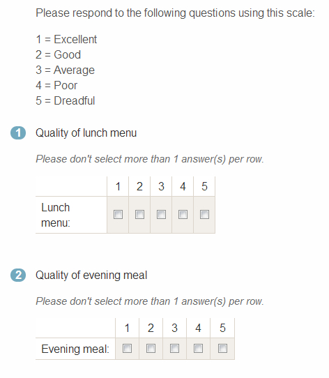
A screen shot of a multiple choice question with a separate scale
A better approach would be to avoid using a separate scale. Instead use explicit wording for each answer. The user would then be reminded of the possible responses separately for each question:
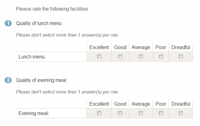
A screen shot of a multiple choice question with explicit labelling
Question grids
Grid questions are often used to group similar questions together with the intention of avoiding repetition and allowing respondents to progress through the survey quickly.
Grids can also result in complicated layouts, both in their design and (from a technical perspective) in terms of form control. This means grids can pose significant barriers both for disabled users and for users completing your survey on a mobile device.
A further issue is that some authors create very large grid or scale/rank questions. We have seen grid questions containing five rows and 15 question columns. This results in 5 x 15 = 75 individual input elements (check boxes, etc.) and it is doubtful that any user, regardless of disability, would find this easy to complete.
To assist with the accessibility of grid and scale/rank questions, online surveys presents all respondents with an option to break the grid out into separate questions. This provides an alternative display format for the question(s) that some respondents may find easier to use.
To make your survey as accessible as possible, we recommend minimising or avoiding the use of grid and scale/rank questions.
Images, audio and video
When using images, audio and video in surveys, you should provide a text equivalent for this content. When inserting an image you will be prompted to enter alternative text in the dialogue box. For other media (audio or video) you should include a separate transcript or caption in the associated note or question text.
Technical delivery of surveys
Form controls
Online surveys associates labels with their associated form controls for all question types, except for questions in a grid and questions in scale/rank formats. As mentioned before, when creating accessible surveys we recommend that you avoid using grid or scale/rank questions, as the complicated structure can cause significant problems for some user groups.
It should be possible to complete surveys without the use of a mouse. Respondents can tab between questions and submit surveys using only keyboard input.
Similarly, if a browser or other user agent does not support JavaScript, this should not prevent the completion of a survey. For example, while the date question type uses a JavaScript “date picker”, it also provides a description of the response format required (e.g. DD-MM-YYYY). This way respondents can enter text in the correct format if the JavaScript date picker isn’t available.
Semantic structure and headings
Online surveys is designed to produce semantically correct and valid HTML. However, it is possible for survey authors to add their own HTML using the note item, so the survey output can be affected by survey authors.
Similarly, online surveys produces surveys that have a correct document hierarchy (<h2> following a single <h1> etc.), but survey authors can accidentally leave out some heading levels (by not using sections or other titles as intended in their surveys) or introduce other headings using notes. These changes from the default output of online surveys should not raise significant accessibility problems, but authors are encouraged to pilot their surveys with as many different user groups as possible before distributing them to their intended audience.
Colour schemes and text
The default theme adheres to the AA contrast level set out in the Web Content Accessibility Guidelines version 2 (WCAG2) and has been tested using the Snook Colour Contrast Checker. If you have chosen a different theme you will need to check the contrast ratios separately.
The ratios are as follows:
- Large text (bold text of 120% and 130% in size) has a contrast ratio of 3.66:1 (i.e. greater than 3:1).
- Section headings, question text and possible answers have contrast ratios greater than 4.5:1, as required by the WCAG2 guidelines. The precise ratios are:
- Section text: 5:1
- Question text: 10:1
- Possible answers: 10:1
Colour schemes suitable for one group of people can cause difficulties for another. For example, high contrast can help users with a visual impairment, but it can also pose problems for people with dyslexia. We have aimed for a balanced approach in creating the standard online surveys theme.
Most importantly, online surveys can be completed with style sheets disabled or with a user-specified style sheet applied. So, whilst we’ve tried to achieve a good balance, it is also possible for respondents to override the colour scheme completely, should they need to.
We have adopted a similar approach to the text size used in surveys. We have aimed to provide a good balance between attractiveness and usability. We have also made sure that users can increase the font size using the functionality in their browser. We have not provided a separate tool to allow users to increase/decrease font size on the survey page, as this would just replicate functionality already available in their browser. Further information on this topic can be found in the following FAQ: Can I change the font size in my surveys?
Conclusion
Online surveys makes creating accessible online surveys easy as many accessibility considerations are already included by default. However, it is still important for you to examine your survey from your respondents’ perspective. You should always test or pilot your survey with as many users as possible. Authors can perform some tests themselves (e.g. checking that the survey can be completed using only a keyboard) but the best way to make sure your survey works with particular user groups is for representatives of those groups to test it. Testing will also identify any problems with the language used in the survey.